Accessibility is a quality of software that enables use by individuals with a range of visual, hearing, movement, and cognitive abilities. Although the needs for specific websites, mobile apps, and other software vary widely, Quoin understands that accessibility is an important aspect of design and implementation. Our project teams have extensive experience in building for accessibility, including the key standard W3C Accessibility Initiative. This set of guidelines includes many best practices, such as display of alternative text for images, support for keyboard input, and use of transcripts for any audio content. We often engage our client stakeholders on the level of accessibility as part of the overall visual design.

Insights
Visual Design for Color Blind Users
 Brad Kain
October 21, 2016
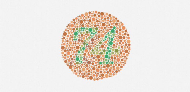
An interesting requirement is support for individuals who have some type of color 'blindness'. Approximately 8 - 10% of the population has some form of limited color vision, which makes this an important consideration for website and mobile app design. Color blindness is largely inherited, although a very small number of people have acquired color blindness. Men are much more likely to be color blind since the genetic mutation that causes the condition is linked to the X chromosome. (Males have an XY pair of chromosomes, thus a single inherited mutation leads to color blindness.)
The National Eye Institute provides a succinct overview of the types and causes of color blindness. Another source is Color Blind Awareness. Individuals with normal color vision or trichromacy, have the ability to see all three primary colors – red, green, blue. Color blind individuals will have low limited or no ability to see these colors. The most common forms in order are red-green, blue-green, and blue-yellow color blindness. To view a simulation of how these conditions affect your own perception, Causes of Color has a useful Visual Simulator. As an aside, I am almost entirely red color blind, a condition labeled protanopia. I often cannot discern black from red, and confuse any two colors distinguished by the presence of red – blue versus pink, yellow versus orange, and other combinations. I once referred to something as 'watermelon blue'.
Yet, how can a visual design accommodate this range of conditions? We have found the following three best practices are the most important to color blind accessibility.
Use contrast – Elements of the visual design – text, background, and user controls – should be easily recognized by users with normal and low color vision. Since the perception of color varies, the best approach is to use light and dark tones for contrast. Using black and white exhibits the greatest contrast, but does not yield the most modern aesthetic. Thus, an accessible visual design will use a palette of light and dark colors. In particular, avoid color combinations that depend on red - blue/purple, yellow/orange, etc are challenging for users with a red-green color blindness.
Use color and other indicators – A visual design includes elements that indicate the need for user attention or action. These visual cues should not depend solely on color, but use use other graphic indicators. For example, a flag icon might indicate a high priority message. Color can be used as a secondary cue, as long as the combination of color and cue are still high contrast.
Evaluate your site for color accessibility – A visual design should be evaluated for usability by use of a color contrast check or simulator. Here are a few favorites:
Here are some additional resources on color blindness and visual design practices:
