In 2021, the National Hospice and Palliative Care Organization (NHPCO) engaged Quoin to design and build a new, more user-friendly web application for their nationwide Quality Connections program. This program aims to improve industry standards and enhance the knowledge base of hospice and palliative care staff by providing educational tools, practical resources, and access to various webinars and conferences throughout the year.
Quality Connections’ legacy site was based on an open-source learning platform, which had been configured by another vendor to fit the program’s needs. This solution supported many of their basic features but ultimately contributed to a sprawling site that was difficult to navigate and often led to dead ends. After receiving client feedback that the user experience was confusing, it became clear to NHPCO that the Quality Connections program had outgrown its first home and was ready for a custom application all its own.
Before Quoin started the development of the new Quality Connections web platform, we spent time talking with the NHPCO team to better understand their needs and expectations for an improved user experience.
When it came to an improved user experience, NHPCO’s top goals included:
- A distinctive design aligned with NHPCO’s branding
- The ability for participants to visualize progress automatically and clearly in the program as tasks are completed
- Creation of a user-friendly Admin dashboard that incorporates more efficient program reporting, content changes, and other administrative tools
Once these goals and expectations were established, our team got to work. We started by looking at the program and thinking “what could be done design-wise to stay within the current site design while giving it a ‘fresher’ look for users as they proceed through the program?”
Useful Visualizations: Activity Pillars & Progress Rings
The workflow for the Quality Connections program is built around the four Activity Pillars, each of which contains a set of course activities designed to promote education, practical application of learned skills, performance measurement, and innovation. Participants must complete a specified number of activities from each Pillar in order to graduate the Quality Connections program. Therefore, tracking course progress and identifying remaining gaps in each Pillar is an extremely important facet of the user experience.
The previous site utilized a set of colors associated with each Pillar, which we decided to carry over into our new design to enhance users’ feelings of site continuity and familiarity. We also maintained the previous site’s visual iconography for tracking progress: the Progress Rings, whose outer orbitals reflect the percentage of completion of each Pillar.

We created an updated and user-friendly interface with the Activity Pillars and Progress Rings displayed in this fashion. Users now see a clear visual representation of their progress and can maneuver to each activity pillar with ease.
Our new design maintained the branding, colors, and iconography from the original site, but condensed the previously sprawling site pages into a more centralized workflow. We created new layouts for important pages such as the Homepage and the Track My Progress page, redesigning the user experiences to function more as “one-stop shops,” or useful bases where users could view and access their information in one glance.
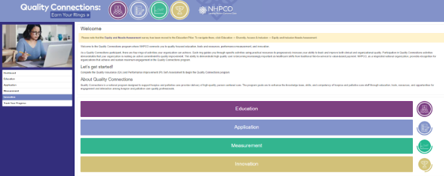
Originally, the Quality Connections homepage contained only a welcome message, without a clear path to starting coursework or tracking progress. To create a friendlier and simpler experience for users when they logged in, we integrated the welcome messages from the previous site with new navigable elements such as activity pillars, the progress rings, and the side navigation menu. The updated homepage also displays the Activity Pillars of Education, Application, Measurement, and Innovation in a central position, so users can navigate directly to any pillar’s activity list as soon as they log in.
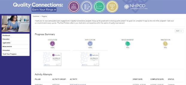
NHPCO had expressed that one of their priorities was to give users better access to their progress throughout the entire program. Therefore, we implemented a ‘Track Your Progress’ page, accessible on a side menu from any page of the site, so that users were able to easily navigate to it to check their progress via the ‘Progress Rings’ status.
When designing this page, we kept the user experience in mind so that it would show all accomplishments, progress statuses, certificates, and individual activities’ state of completion in one place. Acting like a program transcript or a report card, users can now easily access this page from the side navigation menu when they want to know where they stand in the program.

By including course certificates in an SVG format and displaying them below each Progress Ring once an activity pillar has been completed, users now have easy access to their certificates of completion that they can then share or post on their own social media sites to display their achievements from the Quality Connections program.
It was important to NHPCO that the new application retained the same administrative abilities as the original site, such as editing content, updating webinars, adding new activities, and generating reports.
To implement an Admin Portal, Quoin chose to use Strapi, a headless CMS that is used for building self-hosted, customizable, and performant content. The new admin portal gave NHPCO’s administrators the ability to do all they needed - from building new reports to adding new activities - with additional brand-new features still in the works.
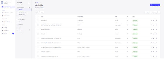
We created an Admin Portal using Strapi so that the program administrators and content editors could still edit activities and monitor participant users.

We ensured that the Admin Portal for the new Quality Connections site allows NHPCO staff to create customized admin reports, and export them as excel files. Admins can also generate progress reports, course transcripts, and reports on milestone completion from third-party learning platforms whose activities are integrated with the application.
Quoin continues to work with NHPCO on improving the Quality Connections program for the upcoming year and onward. With so many new features and enhancements currently in place, the future of Quality Connections is nothing but upward in regard to user engagement. The contemporary and modernized user interface that has been implemented will continue to drive users back to the program each year and with that, comes new and improved activities. This, in turn, will improve program choices that will be expanded upon and help the hospices gain more knowledge and skill sets to better assist their organizations.
